The Internet of Things

The Internet of Things

On 13 September, Frantic took part in Helsinki Design Week 2013 by having an open house and showing the visitors several demos of different gizmos that our designers and propeller-heads had envisioned. We also demonstrated a few new devices that we think we can build services on top of.

Internet-controlled Scalextric car track

Racing: fast cars, stench of motor oil, screeching tires, life-endangering stunts on a slick track and champagne for the winners? It can be that, or something much more exciting.

To showcase how to connect internet services into real-life devices we took two Rasperry Pi minicomputers and connected them to a classic Scalextric car track. Each Raspberry Pi computer has a custom web server software in them and controls one track. Once loaded to a mobile phone's browser it hooks into the phone's orientation sensors and sends the sensor values to the minicomputer via web. After that the phone's orientation regulates how fast the car goes, via internet.

It’s really inexpensive to connect internet to real-life devices, and writing the custom software is fairly straightforward. We use the same techniques on the client's sites daily.

We are preparing to publish the implementation instructions and software Open Source on GitHub. Stay tuned if you want to have your own internet-controlled Scalextric track for a Christmas party!

More on the subject from my presentation about IOT

Responsive design in 10 steps

Responsive design in 10 steps

Mobile web is already here, and it can no longer be ignored. So how to prepare for this? The web is changing and we need to change the way we design for it.

This article does not dwell on the nitty gritty technical stuff and code of responsive design; if you want to read about that I suggest you start by reading Ethan Marcotte’s post about the fundamentals:http://www.alistapart.com/articles/responsive-web-design/

If you’d like to see responsive design in action, you don’t have to go very far. We designed the new Frantic website with the responsive mindset – just try resizing your browser window, and see what happens!

1. Plant the seed

Just start thinking that the site you’re creating is going to be viewed on different devices and, more importantly, in different contexts. The users can be surfing with their mobile phones on the go, or checking the site out on the huge retina display on their new iPad while lying on the sofa. In each case the old way of delivering the content in one format is somewhat obsolete. Knowing that there are variable screens and ways of use will spark new ideas about the way your content can shine.

2. Get cracking!

Start developing your content with context in mind. What do you want to say when the screen is huge or small? What will the priorities be? This time you really have to step into the user’s shoes and think of all the possible ways of use. Wireframe these stages, where the site is different, and prototype with tools like Twitter’s Bootstrap or Zurb’s Foundation. They will help you take your wireframes to the next level and help you understand the way fluid grids work.

3. Do teamwork. Seriously, do it.

The lone wolf tactic does not work here, so teamwork is needed from the start. Designers have to talk with developers about the solutions that are on the drawing board. Nobody likes last-minute surprises that need to work on multiple devices and browsers.

4. Create a design language

How to design for a vast number of devices? What are they? Should we make different visuals for all of them? No. Create a design language that will be consistent on all of the devices; it still may vary a little from device to device. 

5. Simplify and get to the point

When browsing with a mobile device, users tend to want content right away, so keep it simple and straightforward. Take the load times in count and hide stuff that the user with a mobile phone does not need. 

6. Mobile first

The mindset of creating content for mobile first creates focus and opportunity to make the desktop version come to life, while the core idea of the website is optimal for the smallest of screens. 

7. Test as much as possible

Test your solution with the devices at hand and test it on the go, just to get a feel for the content while you’re out and about. 

8. Pick the right tools

To help your workflow there’s many tools, for example Adobe Shadow, that help you preview the code and designs on multiple devices at once. These come in handy when you don’t have a testing server.

9. God is in the details

Be ready to clock some extra hours to fine tune the details of the content, visuals and code. Add special treats for retina displays, Easter eggs for the desktop users, turbo boost the analytics and check the error pages and Humans.txt file. 

10. Future friendly

What next? Your site should now be ready for a myriad of situations and displays, and maybe in the future your food blog will be on the retina screens of modern fridges or an automotive fuel saver application page will be found on electric vehicle dashboards. Let’s start making the web future friendly.

The stories behind the pixels

The stories behind the pixels

Behind every web project, there is a team of hardworking individuals. Should the human side of the web be told?

We've done thousands of projects over the years with interesting and wonderful clients. We tend to only remember the end results that followed, but what about the people behind the sites and products? Are they important or relevant?

Yes, they most definitely are. Pixel benders, code magicians, designers, producers – they all bring the personalities and the human side to the mix that makes the projects great. The stories behind the work are usually the most interesting ones and the ones we can connect with. Still, most of the publications around web design are centred around tutorials and posts about the design or coding itself.  

Web stories in print

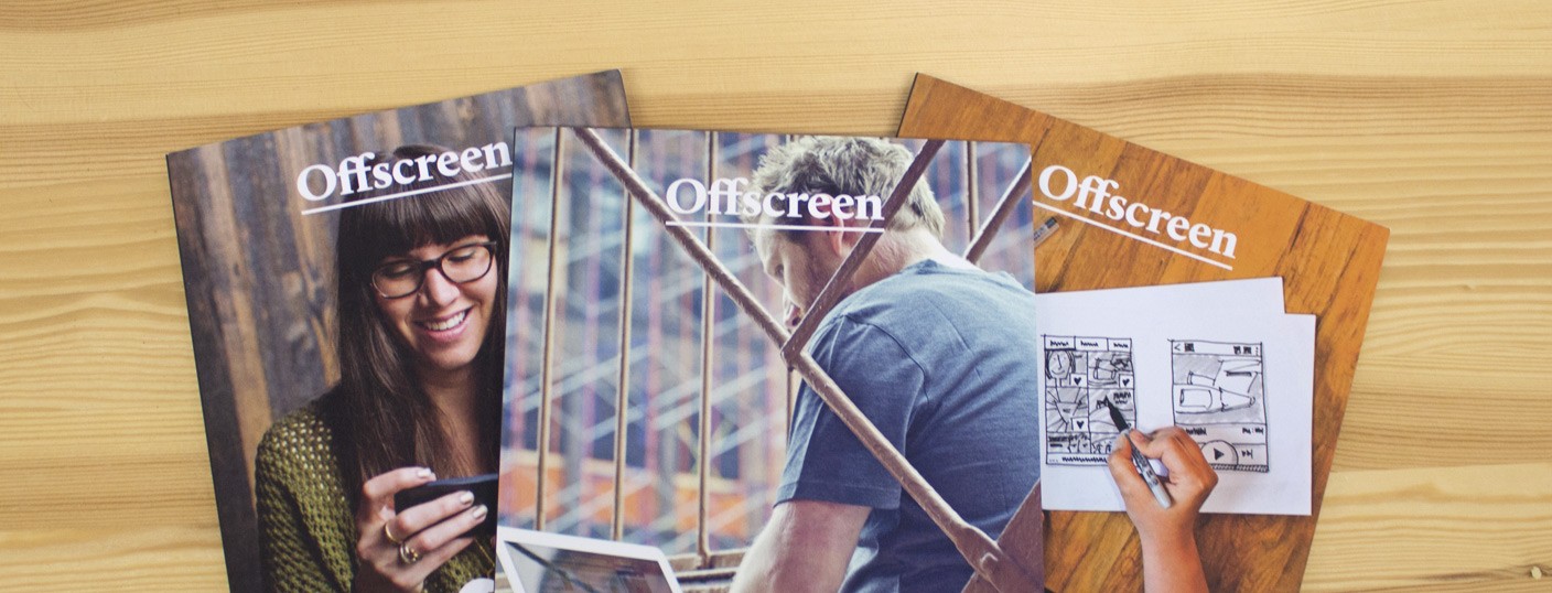
Offscreen Magazine, founded by Kai Brach, brings these stories behind the work into the limelight in gorgeous printed form and in their blog. The magazine is a way to unplug from the computers and just focus on the stories and the people behind the websites. By the way, you can read stories about some pretty famous names in the magazine, like Jeremy KeithRyan CarsonJon Hicks and Eva-Lotta Lamm, for example. 

Reading about the creators of the apps and websites we use every day is refreshingly different. Knowing more about the web heroes and heroines we admire can make us better at our own work. Reading about their life and work shows that they are not that different from the rest of us, but yet they do set a kind of example for us all. 

I had a brief chat with Mr. Brach about his work with Offscreen Magazine:

What made you start to publish a magazine?

In late 2011, after ten years of working as a web design freelancer, I just had enough of dealing with clients. I took a six-months break and went travelling. During that time I caught up with a lot of folks I only knew through the web. It was great meeting the faces behind the interfaces. At the same time, I've spent a lot of time in book shops buying print stuff — I love a good bookstore! That's how the idea of Offscreen began and when I came back I actively started working on it. I wanted to create a product that, on one hand, provided a break from the screen for people like myself, and on the other hand showed what was actually happening behind the screens/scenes of the more successful websites and apps we use on a daily basis. Ironically, in order to produce that product, I now spend more time online than ever before. ;) 

What was the biggest challenge in making the magazine a reality?

The biggest challenge was that I didn't know anything about print or publishing. I had never worked with Indesign, never wrote or edited a lengthy piece of content for a publication, and never produced anything more than a cheap flyer in print. English isn’t even my first language. 

So I started to read books on the topic, researched online and took online video courses in Indesign, pre-press, colour management, typography, and so on, until I felt (sort of) confident enough to get started. There are lots of other things I had to learn and, in retrospect, I think being naive and ignorant about them helped me to a great extent. I just got started without thinking too much about whether I could or couldn't do it. It taught me the lesson that being an outsider can have huge benefits. You look at problems with a fresh set of eyes and figure out things your own — sometimes better, sometimes harder — way. 

The idea about the human side of websites and apps is great, how did that come to you?

As mentioned above, I really liked hearing about the stories behind some of the apps and services I was already using. It's always inspiring to hear that the most successful folks in our industry started with the same set of skills (or lack thereof). I also think that with all the digital stuff we produce and consume on a daily basis, it's important to remember that there are real people behind this. The next time we rant about a badly executed design or a not-so-perfect user experience, keep in mind that people like you and me have spent days, weeks, months on this and put a lot of their heart into it. It's difficult not to take things personally, so with Offscreen I hope I can make people a bit more aware of the human factor in our industry.

What do you see in the horizon for Offscreen?

Every issue is a *lot* of work. It's a constant struggle to get the magazine right, and as the only person producing it, I'm always thinking about it — like literally 24/7. I often wake up in the middle of the night thinking, what should go in the next issue? Will I have all the content on time? Will people get bored of the magazine? etc. It's exhausting and I'm not sure how long I can keep it up. At the same time, launching a new issue is one of the most exhilarating experiences I can imagine. The good thing is that I don't have a bigger publisher breathing down my neck, so if I feel like I need a bit of a break I'll take it. I'm actually thinking about producing another little (print) product that I've been procrastinating about for a while before the end of the year, which may delay the next issue by 1-2 months. I love having that freedom and I'm sure my readers will sympathise with that too.  

The inspiring stories and photos in a well-designed package is a treat to the eyes. Also check out the blog – and continue to read the stories behind the pixels we make every day. 

Why should designers learn how to code?

Why should designers learn how to code?

There has been heated discussion about designers learning code on the web, and here is one more view about it.

Some people say that we should keep the boundaries of the traditional divide between developers who create the code and the designers that design the experience. There are heated blog posts that deny the benefits of people other than developers coding or understanding code and then there are many posts that say that we should brake this divide. At Frantic we are braking the divide. We believe that teams work better when the developers understand basics in design and vice versa. The web design process has changed radically and the people should follow. It's the nature of this industry. To illustrate this point I've put together a couple of reasons for designers, producers, managers etc. to learn to code: 

Gain understanding

It's about understanding the medium and the products you design. Once you see how the web works, the solutions designed are more realistic and translate better to the final shape and form. Steve Jobs once said in an interview: "I think everyone should learn how to program a computer, because it teaches you how to think."

Communication

Programming is a form of communication. A deeper understanding of the form and the aspects that developers use to create code helps the people around them to make better designs and projects. Being on the same page makes the teams tighter and the work more effortless.

Exploration

Once designers begin to understand code and venture out of their comfort zones, new things start to happen making it much harder to fall back into old ways of working. Some say this restricts the designer, not resulting in the best possible design, but this is not necessarily true. Good designers will relish the serendipity when trying out something new.

Control

Once you are working with the code for the product or service you gain better control over the things you have designed. It's not the developer's interpretation of your Photoshop file, it's the designer's own view and execution.

Working with new tools

Code can do a lot of things that Photoshop can. The latest evolution in CSS and browser debugging tools let the designer create the typography and visual styles without ever leaving the browser. Coding is also great for creating automated systems, making the code work for you in precise manner. One example is Joshua Davis , a designer who uses code to combine mathematical patterns with illustrations. I used ActionScript to do all the boring repetitive and boring stuff when I was using Flash back in the days. JavaScript can do lots of the same things in HTML.

Taking the first leap?

If you are daring enough and ready to learn the ways of the Force… Er… Coding, there are lots of ways to start learning: 

Books that are short and sweet:
A Book Apart collection 

Magazine tutorials:
There are some great examples in .net magazine

Videos:
Lynda
Treehouse

Self learning and projects:
CodeAcademy is the web service for anyone wanting to learn coding

Time to break the mould

Time to break the mould

Is web design stuck in a rut? Are we being as creative as we could be?

During a few days of browsing the works of others and the projects we’ve done here at Frantic, I've discovered a bigger pattern that has emerged over the years.

We tend to take the trends that shape the websites – the big intro pictures, scrollable lists, feeds and cards of content – for granted and not question them. This is one piece of proof that the web as a medium is maturing to a stable format. But stable doesn’t mean that the designs always have to follow a certain pattern. In web design, the technology has always set constraints to the design – and that is just fine. But having said that, we need to keep pushing the constraints to the limits to achieve new things. It’s the beginning of 2014, so it’s a good time to start refreshing the way we work.

Let’s be brave

Next time the site sketches start with a big featured image and continue with the patterns of familiar elements, take a step back and try to come up with a couple of different approaches and see how the alternative solutions could work. Try doing a couple of Sketchboarding sessions to get as many ideas as possible to the table. Sometimes the obvious and the familiar blind us from fresh ideas. Changing tools and methods can help bring fresh views to the design as well. The idea is not to force out something out of the ordinary just for the sake of it, but to see past the first ideas that come up and thus maybe create something new. Going with something unfamiliar takes guts – but the web is a perfect environment to test out new approaches.

Break the rules

While the bootstraps and patterns help us to come up with solutions that work, the friction caused by breaking the rules and surprising the user can result in increased social sharing or even better: bigger movements like the now famous “Konami Code”. Remember to help your clients understand the value of breaking the rules, as contrast differentiates you from the rest, draws attention and creates emotion. And emotion is the glue that keeps the users interested in your message.

Bringing back that craftsmanship

Web to me is a handcrafted world and all about the people making it a better place. There's a big difference between building on top of someone else’s work and creating something yourself. Creating new things from scratch let’s you explore much more. I like to think that it’s like playing with the smallest LEGO blocks: with them you can create anything.

So now it’s time to sketch, draw, code and design. Be inspired and find your own path to the great designs of 2014.