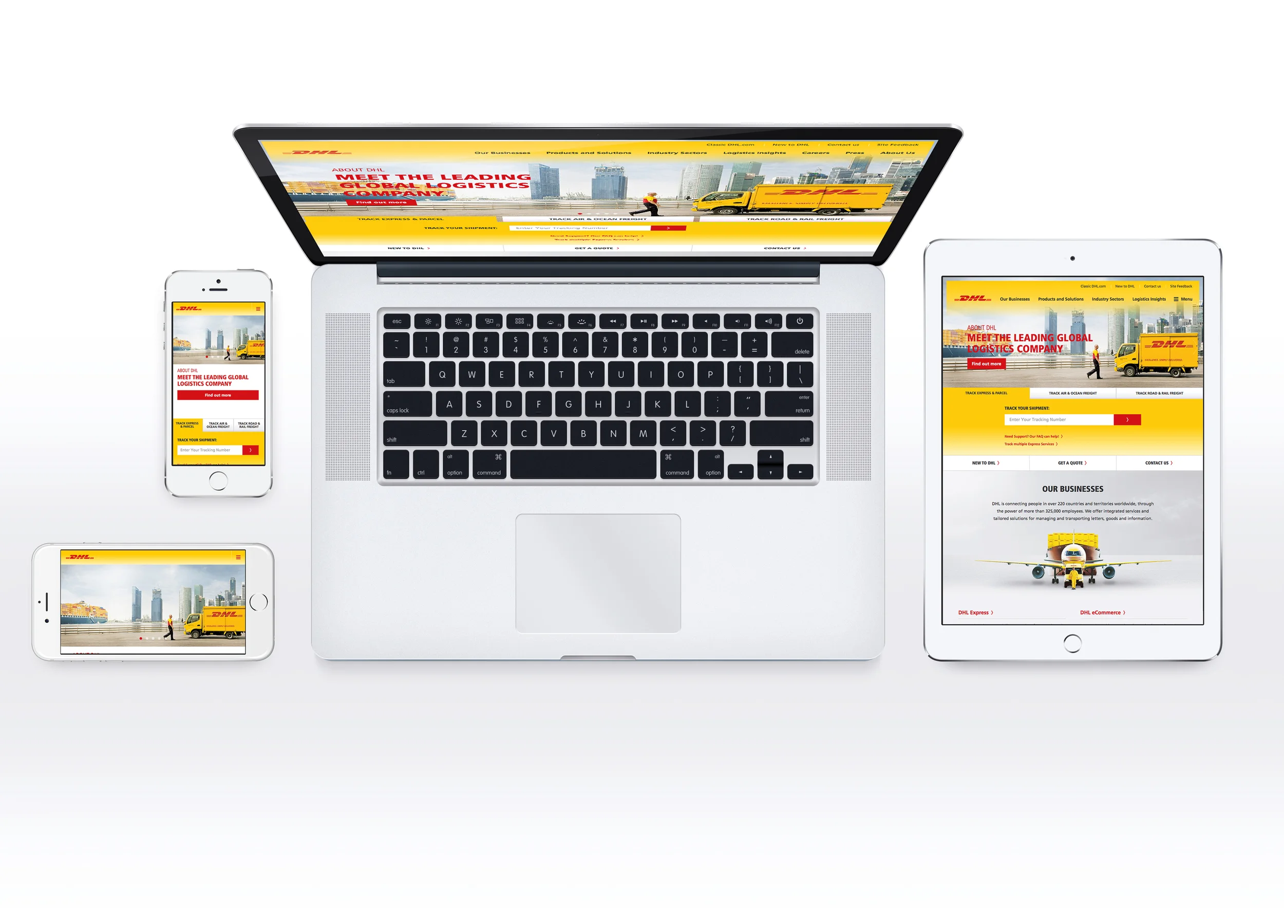
Mobile web is already here, and it can no longer be ignored. So how to prepare for this? The web is changing and we need to change the way we design for it.
This article does not dwell on the nitty gritty technical stuff and code of responsive design; if you want to read about that I suggest you start by reading Ethan Marcotte’s post about the fundamentals:http://www.alistapart.com/articles/responsive-web-design/
If you’d like to see responsive design in action, you don’t have to go very far. We designed the new Frantic website with the responsive mindset – just try resizing your browser window, and see what happens!
1. Plant the seed
Just start thinking that the site you’re creating is going to be viewed on different devices and, more importantly, in different contexts. The users can be surfing with their mobile phones on the go, or checking the site out on the huge retina display on their new iPad while lying on the sofa. In each case the old way of delivering the content in one format is somewhat obsolete. Knowing that there are variable screens and ways of use will spark new ideas about the way your content can shine.
2. Get cracking!
Start developing your content with context in mind. What do you want to say when the screen is huge or small? What will the priorities be? This time you really have to step into the user’s shoes and think of all the possible ways of use. Wireframe these stages, where the site is different, and prototype with tools like Twitter’s Bootstrap or Zurb’s Foundation. They will help you take your wireframes to the next level and help you understand the way fluid grids work.
3. Do teamwork. Seriously, do it.
The lone wolf tactic does not work here, so teamwork is needed from the start. Designers have to talk with developers about the solutions that are on the drawing board. Nobody likes last-minute surprises that need to work on multiple devices and browsers.
4. Create a design language
How to design for a vast number of devices? What are they? Should we make different visuals for all of them? No. Create a design language that will be consistent on all of the devices; it still may vary a little from device to device.
5. Simplify and get to the point
When browsing with a mobile device, users tend to want content right away, so keep it simple and straightforward. Take the load times in count and hide stuff that the user with a mobile phone does not need.
6. Mobile first
The mindset of creating content for mobile first creates focus and opportunity to make the desktop version come to life, while the core idea of the website is optimal for the smallest of screens.
7. Test as much as possible
Test your solution with the devices at hand and test it on the go, just to get a feel for the content while you’re out and about.
8. Pick the right tools
To help your workflow there’s many tools, for example Adobe Shadow, that help you preview the code and designs on multiple devices at once. These come in handy when you don’t have a testing server.
9. God is in the details
Be ready to clock some extra hours to fine tune the details of the content, visuals and code. Add special treats for retina displays, Easter eggs for the desktop users, turbo boost the analytics and check the error pages and Humans.txt file.
10. Future friendly
What next? Your site should now be ready for a myriad of situations and displays, and maybe in the future your food blog will be on the retina screens of modern fridges or an automotive fuel saver application page will be found on electric vehicle dashboards. Let’s start making the web future friendly.
